
Avoid Common Mistakes With Backgrounds
The background used on a web page, sometimes can mean crucial things to the webmaster. Because of poor quality background, eCommerce website owners lose sales and those who try to provide valuable information, lose visitors.
Unless, you are a fan of “clean” web design, you might be in trouble too. Some people, who have no sense of style, make terrible mistakes trying to “dress” their sites as beautiful as possible. Especially, when they become obsessed with “nitty gritty” background images.
You won’t believe how many web pages there are on the internet that look so bad, that you have no other choice left, except clicking the “Close” button on your web browser. And most of the time, the primary reason is bad background design. If it’s not the background image, then it might be the wrong color of background that leads to a failure. Below, we’ll try to examine the good and the bad of website’s background design.
Too Funky Background
Here’s the example that shows you what not to do with your website’s background.

Well, was it easy to read the text? Now imagine that your whole page is covered with this background. Not so tasty anymore isn’t it. As a matter of fact, this one above was pretty good compared to some other backgrounds that people use.
As you see, interesting backgrounds, at the first glance, seem to be able to improve the quality of your web page, but in reality, it just diminishes user’s experience.
Wrong Background Color
Problems occur, when web designers choose too bright colors for their backgrounds and text. Look at the example below.
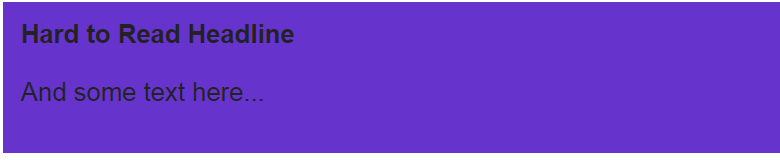
Even if you don’t use background images, you are still at risk making something like that. A tip for inexperienced designers would be not to use dark backgrounds in the first place. Because it’s harder to read. Even if you have a black background and white text. And second, don’t mix too bright backgrounds with too bright text. It also makes it hard to read as you see.
Blinking Backgrounds
Now that’s the worst you can think of. It’s pretty amazing what people sometimes make with their websites. Look at the example below and ask yourself: “Is it really good for my website?”.
Avoid moving background images at any cost!
Many webmasters try to surprise their visitors when winter holidays come. They usually put some moving snowflake images on their web page backgrounds and hope that it will entertain their visitors and keep them reading the content. Truth is, animated backgrounds distract your eye from the text. After some time, they get boring and you just wanna leave a website. So, do not use animated background images on your site.
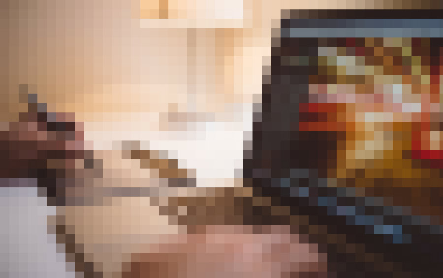
Large Images
Another mistake that novice web designers do, is putting a large image on their background. They take some good looking wallpaper, as large as (800 x 800) or (1024 x 768) pixels and put it all without even optimizing it on their sites. Such 300K or more weighting images make even users with broadband internet connection wait for a while, not even mentioning dial-up users.
Not so bad example, but still not suggested, would be putting a gradient image on the background. Example below:

The background image above looks quite good. Such gradient background images are mostly used on music or gaming websites. But the problem is loading time. That one above was put into a table. But imagine if the whole web page was using one huge background image that is not optimized well. The size would be probably more than 1mb. If possible always optimize your images for the web. However, in this case it’s not very possible, because in order to get high quality picture, you need to keep the size high, especially in the example above.
In Conclusion
If you are a novice web designer, try to follow the advices given above and don’t make such mistakes on your site. It is hard to read on a computer screen already. Don’t make it even harder for your visitors to read text on crazy background images.
It’s very easy to look amateurish, when you do not know anything about web designing. So don’t try to overdress your website. If you are selling products or services on the internet, use clean design instead. White background and black colored text will give your visitors the best experience.